2024
Logo Suite
Juiciest
Juiciest is a family-owned juice bar and lounge that takes pride in delivering fresh, organic, farm-to-table juices. With a commitment to sustainability, Juiciest sources only the finest ingredients directly from local farms to craft beverages that are both wholesome and delicious. Every juice embodies the care, quality, and authenticity of a business rooted in family traditions and a passion for healthy living. Juiciest is more than a juice bar. It's a celebration of nature's finest offerings, fostering a sense of community while promoting wellness and vitality.

Concept
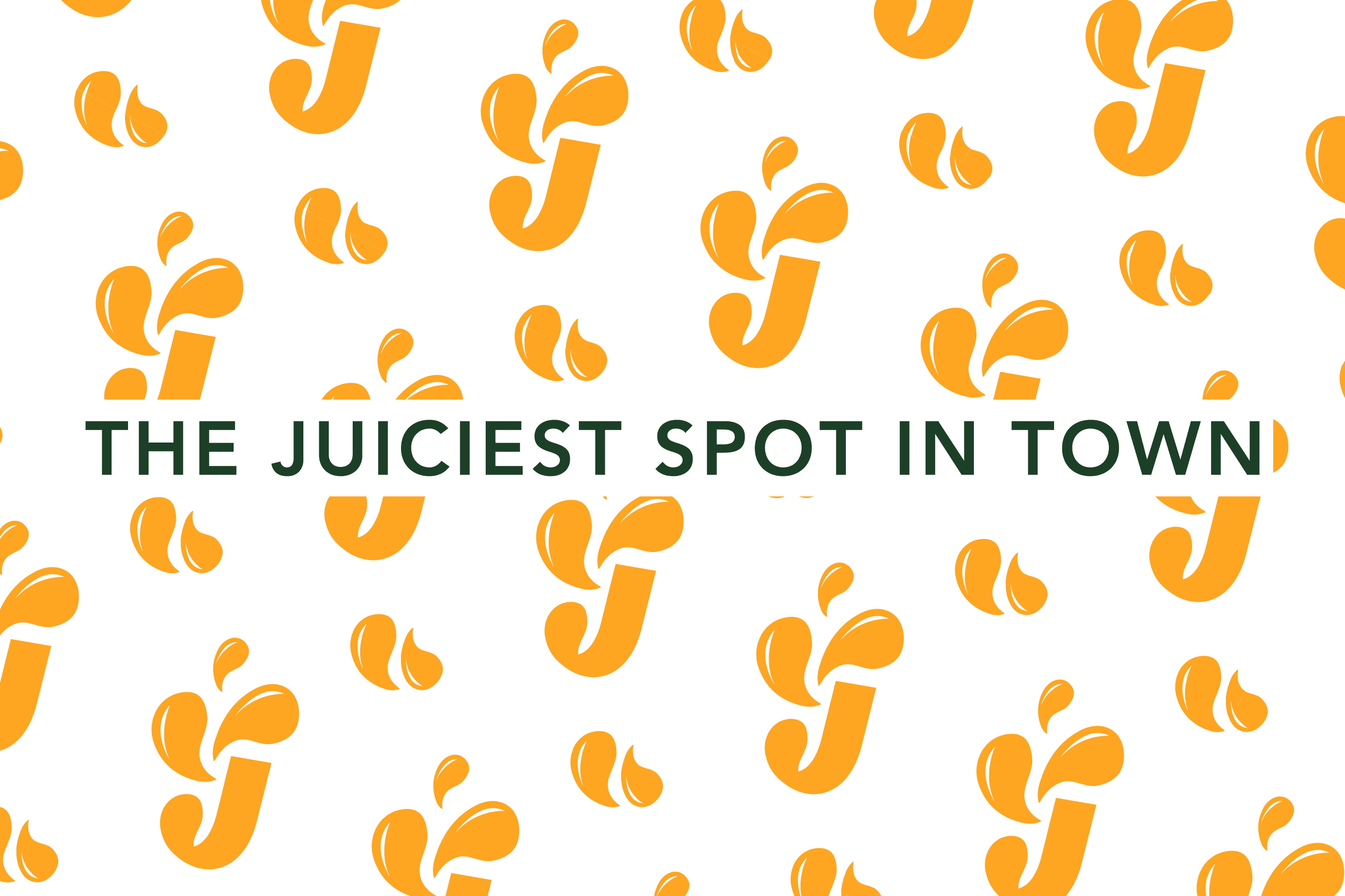
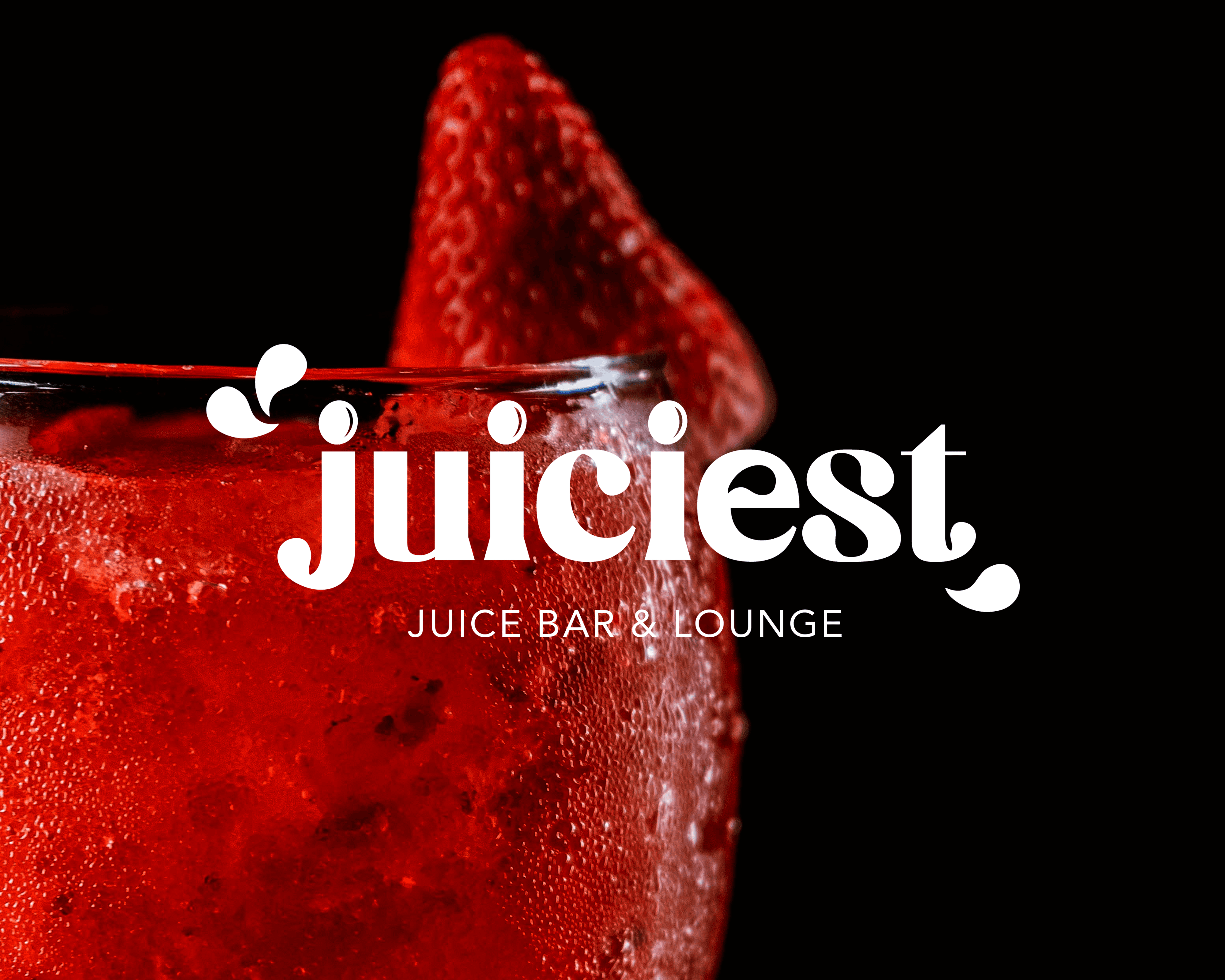
The vibrant green color symbolizes growth, health, and a connection to nature, reinforcing the farm-to-table philosophy. The combination of bold, curved typography with soft droplet forms balances approachability with sophistication, reflecting Juiciest’s commitment to quality and sustainability.

Design
The Juiciest logo captures the essence of the brand's organic and fresh identity through its creative use of juice drops as recurring design elements. The droplet motif flows seamlessly throughout the logo, amplifying the personality of key letters like J, C, S, and T, while also forming the "tittles" (dots) above the J and I. These details emphasize the freshness and purity of Juiciest’s offerings.
The logo’s cohesive design and thoughtful details serve as a visual extension of Juiciest’s mission: to bring the best of nature into every glass, with a modern yet timeless touch